
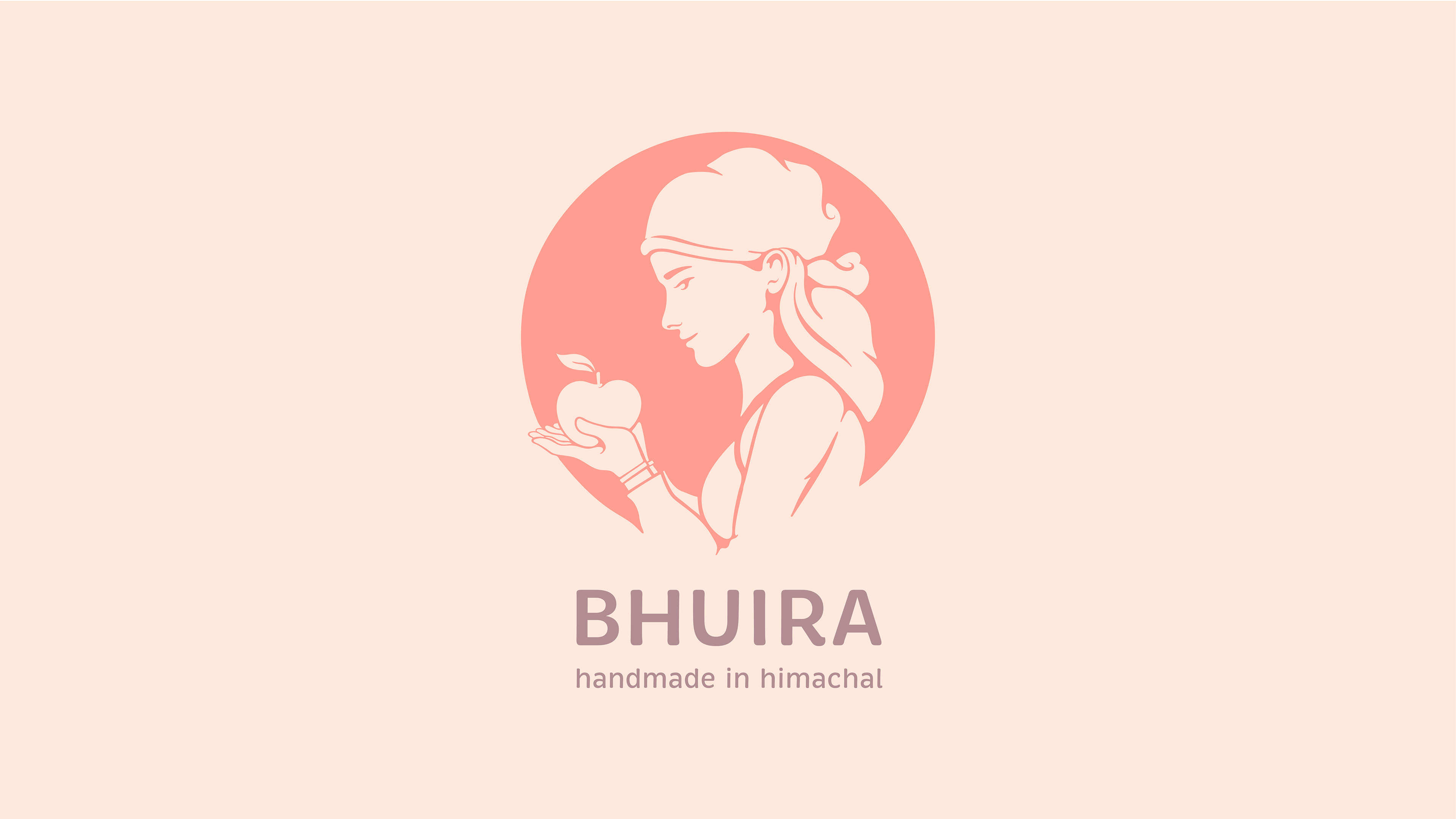
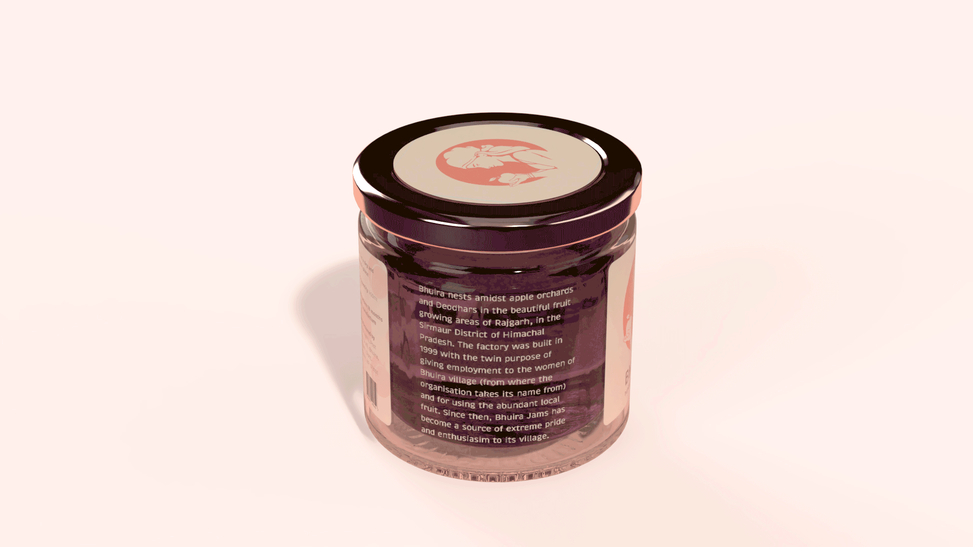
The outcome of a two week module during my academic course at NID, Ahmedabad. I worked on a symbol for an organisation called Bhuira, which is based in Sirmaur district of Himachal Pradesh. The organisation employs local Himachali women who make jams, pickles, and preserves from locally sourced fruits.
The final form, which took shape after a number of iterations, is that of a Himachali woman with an apple in her hand. The form communicates the initially chosen attributes: happy Himachali women, made in Himachal (through the headgear, a 'Dhattu'), and preserve (through the hand gesture, and a circle in the background).
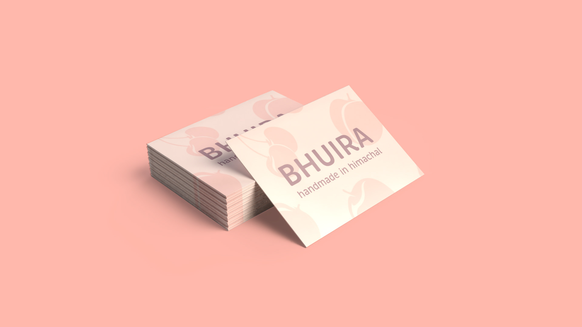
I chose colours from the peach fruit; Bhuria happens to be in the peach bowl of Asia. The colour story of the brand communicates a soft, feminine and sophisticated aesthetic.

2017, National Institute of Design, Ahmedabad
Typeface: Brevia by Hannes von Döhren